

Hyper Goo, Hyper Growth? What Glitchy Maximalism Means for Brands

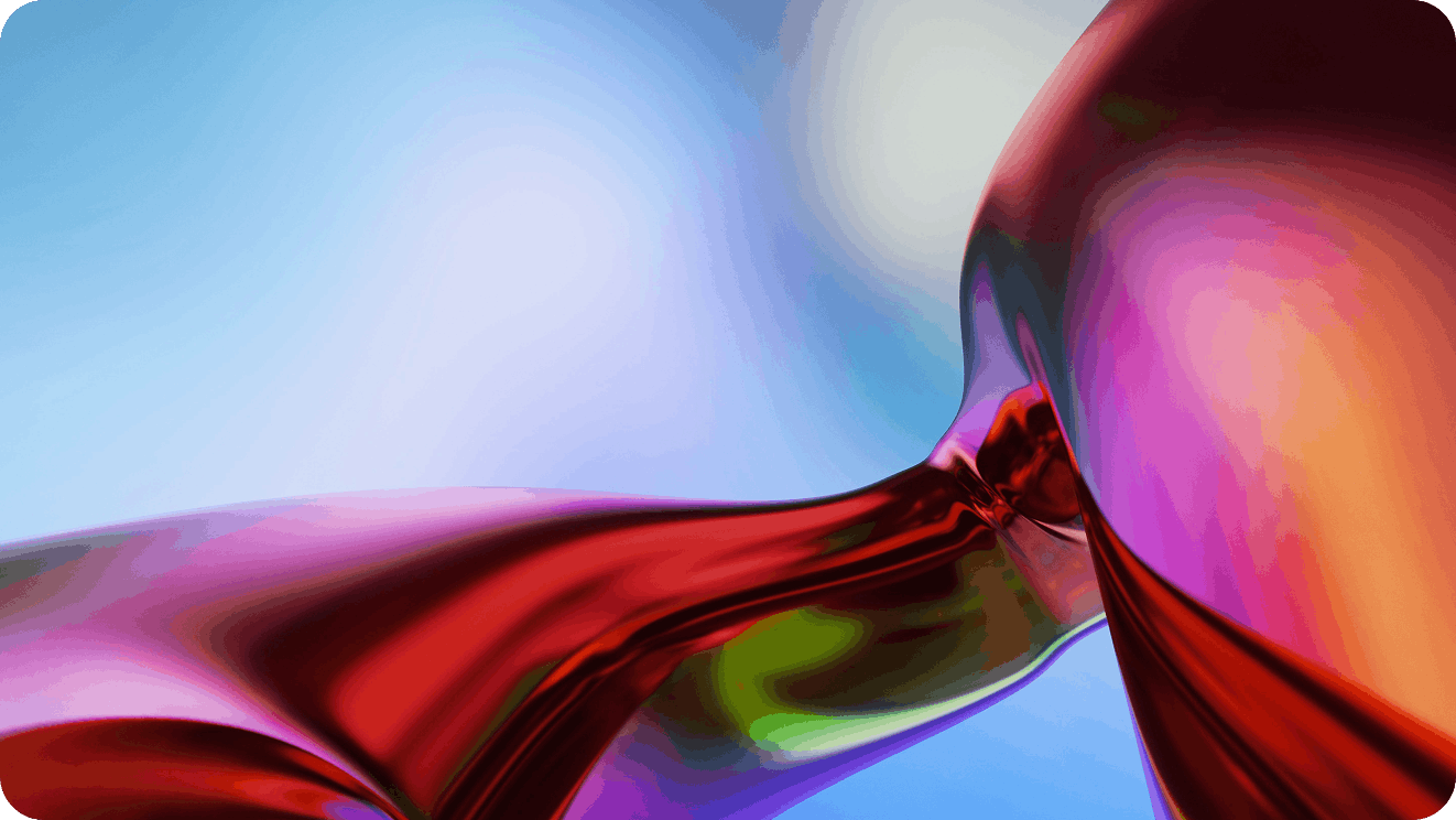
Something has been happening to product packaging, brand campaigns and digital creative aimed at Gen Z audiences, and it's been building for long enough that it now has a name. Hyper goo: the glitchy, gloppy, maximalist aesthetic that the New York Times described as arriving on consumer culture "like a wet sneeze." Text that resembles the inner workings of a lava lamp. Negative space cluttered with doodles. An uncanny mashup of surreal smoothness and digital degradation, with saturation cranked up high enough to startle a Lisa Frank notebook.
It looks chaotic, but (somehow) it isn't. And for brands trying to reach younger audiences in an era increasingly saturated with AI-generated content, understanding what hyper goo is communicating (and what it isn't) is more strategically important than deciding whether to adopt the aesthetic itself.
What Hyper Goo Actually Is (Beyond the Buzzword)
Hyper goo is a visual language, not a brand identity. Understanding the distinction is the starting point for any brand considering how to respond to it.
The aesthetic combines elements from several visual traditions: the psychedelic graphics of the late 1960s and early 70s, the garish digital textures of early internet culture, the hand-drawn imperfection of zine design and the sensory overload of 90s video game interfaces.
What makes hyper goo specifically of this moment is how it synthesizes these references in the context of a generation that grew up online, has developed acute sensitivity to algorithmic content and actively uses aesthetic messiness as a signal of human authenticity.
NSS Magazine, tracking the trend, notes that brands adopting hyper goo aesthetics (particularly in food packaging and consumer electronics) are reaching for fluorescent palettes, graphic compositions rich in detail, and bulky typographies that stand in sharp contrast to the clean minimalism that dominated the previous decade. The visual argument is clear: this was made by a person, not optimized by an algorithm.
The practical effect is visible in grocery aisles. Where Soylent-bottle minimalism once dominated functional product categories, hot pink snack bars with bulbous typography are now fighting for the same shelf space. Some nicotine products have abandoned the sleek, essential aesthetic that once signaled sophistication and replaced it with rounded shapes and small interfaces that evoke 90s video game screens.
This isn't random. It reflects a coherent, if unspoken, consumer preference.
Why Hyper Goo Is Resonating With Younger Audiences
The cultural context behind hyper goo is more interesting than the aesthetic itself (and more useful for brands trying to understand it).
Gen Z is the first generation that grew up in an environment where AI-generated content is indistinguishable from human-made content at a glance. They've developed pattern recognition for what algorithmic optimization looks like — the smoothness, the proportional correctness, the way AI tends toward the statistically average rather than the specifically surprising. And they've developed an instinctive skepticism toward it.
Hyper goo is a visual rejection of that smoothness. The doodle that looks like it was made in Microsoft Paint isn't an accident or a budget constraint, it's a signal that a human made a deliberate choice to put something imperfect into the world. The gloppy typography that doesn't quite align isn't sloppiness; it's a marker of handmade intention. In an environment where AI can generate perfectly polished creative in seconds, imperfection has become a premium signal.
This connects to a broader cultural shift that's been building for several years. Millennials grew up in post-recession scarcity and embraced clean, minimal aesthetics that signaled control and sophistication (think Apple, Airbnb, the DTC aesthetic that defined the 2010s). Gen Z grew up in a different kind of instability: pandemic isolation, climate anxiety and an internet that made authenticity impossible to verify. Their aesthetic response isn't calm minimalism, it's expressive, loud, and deliberately un-optimized. As one characterization puts it, "the pastels that were ubiquitous a decade ago aimed to reassure an earlier generation that they could use their limited spending power to optimize their lives. Hyper goo does the opposite, reflecting back to Generation Z the distortion of the world in which they are coming of age."
For brands, this is useful context beyond the visual trend itself. The underlying preference isn't specifically for goo, it's for content that feels human, specific and resistant to algorithmic smoothing. That preference is durable in a way that any specific aesthetic expression of it isn't.
The Risk of Chasing Aesthetics Instead of Strategy
Here's where the strategic question gets complicated: hyper goo is a real cultural signal. It's also already appearing in enough brand campaigns and packaging updates that its most distinctive quality (the sense of rawness and resistance to polish) is at risk of being optimized away.
When enough brands adopt an aesthetic that originated as a rejection of brand optimization, the aesthetic becomes brand optimization. The goo becomes a template. The deliberate imperfection becomes a formula. And the audience that found the visual language compelling because it felt authentically human starts to recognize it as another form of the algorithmic content they were rejecting in the first place.
This cycle is familiar. Brutalist web design was once a radical departure from conventional UI polish. By the time it was a standard option in design tool libraries, it had lost most of what made it striking. The same dynamic will apply to hyper goo; the question is how quickly.
The risk for brands isn't adopting maximalism or messiness per se. It's adopting the surface-level visual codes of a cultural movement without connecting them to anything authentic about the brand's actual identity. A brand that was built on clean minimalism and shifts to gloppy typography (because hyper goo is trending) isn't making a genuine creative statement, it's making a market research statement; which is exactly the kind of calculated move the aesthetic was designed to resist.
Younger audiences are particularly good at detecting this gap. The brand that adopts the visual language of authenticity without the underlying authenticity doesn't come across as human. It comes across as a brand that did its homework and then faked it. That's a worse outcome than staying with a minimalist identity that at least has the integrity of consistency.
Briefing Agencies for This Moment (Not Just This Trend)
The strategic opportunity hyper goo represents isn't primarily about whether to adopt the aesthetic. It's what the aesthetic signals about where younger audiences are and what they're looking for, and how to brief creative partners to respond to that signal in ways that are genuinely appropriate for the brand.
How to Write Briefs That Capture "Human, Anti-AI" Energy Without Copying Hyper Goo
The brief that produces the most useful response to this cultural moment doesn't ask for hyper goo. It asks for creative that communicates specific qualities the design style is currently signaling: human intention, specific perspective, resistance to generic optimization.
A brief that says "make it feel handmade" invites imitation. A brief that articulates what specific human quality should come through (think the founder's irreverence, the brand's regional specificity, the way the product is actually made by real people in a real place) gives a creative agency something genuine to work with. The aesthetic that results may or may not look like hyper goo, but it will have the underlying quality that made hyper goo compelling in the first place.
Creative direction briefs that anchor on brand truth rather than visual trend produce creative that has a longer useful life than creative that tracks a trend. The brief that generates work genuinely expressing what a brand is earns more trust than the brief that produces work that looks like what audiences currently like because the former is still coherent when the trend has moved on and the latter isn't.
Questions to Ask Creative Agencies About Trend Literacy vs. Brand Integrity
Not all creative agencies are equally equipped to navigate the tension between trend relevance and brand integrity. The questions that reveal this most clearly aren't about portfolio aesthetics, but about thinking process.
Ask an agency how they approach aesthetic trends when working with established brands. The answer that signals genuine expertise is one that distinguishes between trends that express something true about the brand and trends that are purely contextual, and that has a clear method for determining which is which. An agency that can only tell you what's trending isn't the same as an agency that can tell you whether a trend is right for a specific brand at a specific moment.
Ask about a case where they advised a client against adopting a trend that was popular at the time. The answer reveals how much independent creative judgment the agency brings versus how much it optimizes for what clients want to hear.
Ask how they plan for creative longevity versus short-term relevance. The tension between these two is real, and an agency that pretends it doesn't exist isn't giving you honest counsel.
The Breef POV: Standing Out Without Becoming a Visual Cliché
The brands that will look back at this moment with satisfaction aren't the ones that adopted hyper goo most enthusiastically. They're the ones that understood what hyper goo was communicating and found ways to express similar qualities through visual choices that were genuinely connected to what their brand actually is.
Using Breef to Find Agencies That Understand Gen Z/Gen Alpha Culture
The creative partners most useful for navigating this moment are the ones who understand Gen Z and Gen Alpha culture at a level deeper than knowing what aesthetics are currently popular. They understand the cultural anxieties, the distrust of optimization, the preference for human specificity over algorithmic polish. They can distinguish between a brand that has a genuine claim to irreverence and one that's manufacturing it.
Finding these agencies requires looking beyond portfolios that show the right aesthetic outcomes and toward agencies that demonstrate the kind of cultural understanding that produces durable creative decisions. Work history with brands that have genuinely connected with younger audiences on their own terms (not by chasing trends but by finding authentic points of connection) is more predictive than stylistic resemblance to current trend coverage.
Building Creative Directions That Outlast Any Single Aesthetic Wave
The most resilient creative strategy for any brand engaging with hyper goo (or any aesthetic trend) is to build a visual identity that has enough genuine character to adapt across multiple aesthetic moments without losing coherence.
Brands with strong, specific visual identities can incorporate elements of trending aesthetics without being consumed by them. They can lean toward maximalism in moments when that's culturally resonant and toward restraint in moments when that's more appropriate because the identity underneath either choice is clear enough that both directions feel like the same brand. Brands without that underlying specificity don't have the same flexibility — every trend becomes an identity question rather than an execution choice.
Building that underlying identity takes time and requires creative direction that prioritizes genuine character over contextual trend alignment. It's also the work that compounds over time in a way that trend-chasing never does. The brand that knows what it is can adapt; the brand that only knows what's currently popular is perpetually starting over.
The brands that will look back at the hyper goo moment and see it as a contribution to their identity rather than a detour from it are the ones that asked the harder question: not "should we do this?" but "what is it that makes this resonate, and what version of that quality is genuinely ours?"
Ready to find creative agency partners who understand the cultural moment and know when to lean into it versus when to hold their ground? Book a demo call with Breef and find the partners who can help your brand stand out without becoming a visual cliché.


_%20The%20New%20Rules%20of%20Getting%20Found%20Online.avif)


