

Where to Look for Creative Inspiration Beyond the Algorithm
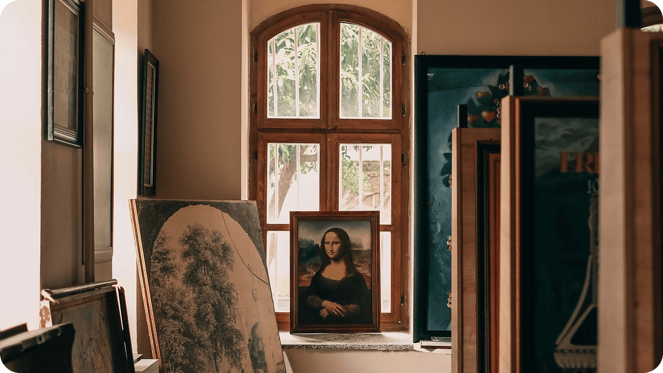
The brands with the most distinctive visual identities and brand voices aren't drawing from a narrower set of references than everyone else. They're drawing from a wider, stranger, more eclectic one, pulling from art history, vintage packaging, mid-century typography, cult cinema, architecture, literature, vernacular design and restaurant menus from the 1970s. Brand marketers who cast a wider net for creative inspiration have far more to work with than whatever the algorithm happened to serve them that week.
Social feeds serve roughly the same content to everyone in an industry. When marketers build their moodboards from those feeds, the work starts to converge, and brands that should look nothing alike end up sharing a color palette and a tone of voice. Being a well-rounded creative means paying attention to things that have nothing to do with social media, then bringing what you find back to the brief.
Why So Many Brands Are Starting to Look the Same
In 2023, strategist Alex Murrell published The Age of Average, an essay cataloging how interiors, cars, architecture, film and advertising have drifted toward a single look. As he put it, "the interiors of our homes, coffee shops and restaurants have begun to converge upon a single style."
Writer Kyle Chayka traced the same pattern in his book Filterworld: How Algorithms Flattened Culture. In an interview with NPR's Fresh Air, he described how "algorithmic feeds and recommendations have kind of guided us into conforming to each other." He pointed to cafés around the world that "looked increasingly similar to each other," even though "no one was forcing these cafes to design themselves this way."
Brand identities aren't immune. In 2018, Burberry removed its Equestrian Knight logo as part of a major rebrand, and five years later new chief creative officer Daniel Lee brought it back. According to Design Week, the restored mark is a 122-year-old motif that won a public competition to design a new Burberry logo around 1901. Only five years after retiring the knight, Burberry decided the best way to stand out was to return to what had made it different in the first place.
What a Wider Reference Pool Gives a Brand
In his 2005 Stanford commencement speech, Steve Jobs described dropping in on a calligraphy class at Reed College after he'd dropped out of his regular courses. Years later, that class shaped the Macintosh. "It was the first computer with beautiful typography," he said. "If I had never dropped in on that single course in college, the Mac would have never had multiple typefaces or proportionally spaced fonts."
Aesop founder Dennis Paphitis applied a similar instinct to retail. Rather than roll out one store template worldwide, the skincare brand gives each location its own design, often shaped by the neighborhood around it. "I was horrified at the thought of Aesop evolving into a soulless chain," Paphitis told Dezeen. "We didn't ever want a standard Aesop shade of orange or green that was plastered onto stores with a nasty logo over it."
Jobs drew on an experience that had nothing to do with computers. Paphitis refused to lock Aesop into one fixed idea of what the brand should look like, which left room for each store to take its cues from its surroundings. Both approaches give a brand raw material that's harder to copy and much easier to recognize.
Where to Find Creative Inspiration Beyond Your Feed
Most of these cost little more than time away from your phone, and each one gives your team inputs your competitors probably aren't looking at.
Fine Art, in Person and Online
Go to a museum and spend real time in a wing you'd normally walk past. If you can't get there in person, major institutions have made huge parts of their collections free to download and reuse. The Metropolitan Museum of Art offers more than 492,000 Open Access works under a Creative Commons Zero license, and the Art Institute of Chicago provides over 50,000 public domain images under the same terms. In 2020, The Smithsonian released 2.8 million high-resolution 2D and 3D images into the public domain.
Print Magazines and Independent Publications
A good magazine makes editorial choices an algorithm never would and puts things in front of you that you didn't pick. Head to a well-stocked newsstand and buy a title from outside your industry, like a gardening quarterly or an interior design magazine. Pay attention to how the layouts pace a story and how the cover lines earn a second look.
Craft Practices Like Pottery and Printmaking
Take a ceramics class or sign up for a weekend woodworking workshop. Craft teaches texture and restraint in ways a screen can't. Woodworkers think about grain and joinery, a reminder that structure can be part of the look. Knitters work in pattern and repetition, and the color chart behind a Fair Isle sweater is a small design system of its own. Cyanotypes, the blue sun prints made by laying objects on treated paper, show how much character one color and a little chance can carry.
The uneven edge of a hand-thrown bowl or the slight misregistration on a risograph print is where a visual language starts to feel made by people, which is a useful counterweight to the polished sameness of most digital work. Picking up a craft you've never tried also gets you comfortable with imperfection. Your first bowl will probably be lopsided, and making peace with that makes it easier to pitch a design or campaign idea that feels a little unexpected.
Old Movies and Cult Cinema
Film is a ready-made education in color and framing. Saul Bass's opening sequences for Alfred Hitchcock's Vertigo and Psycho still influence motion graphics today, and a single scene from a 1960s Italian film can hand you an entire palette. Watch something made before you were born and pay attention to the title cards and the lighting. Streaming services like the Criterion Channel make it easy to spend a month with one director or one decade.
Architecture and the Built Environment
Buildings are brand systems at full scale, with materials and signage working together. Study the brutalist library downtown or the diner that hasn't updated its sign since 1974. Each one makes deliberate choices about color and proportion that you can translate into packaging, retail or a website. If you've never studied architecture, Margaret Fletcher's Architectural Styles: A Visual Guide is an easy place to start.
Literature and Poetry
If the only writing you read is other brands' social captions, your brand voice will start to sound like everyone else. Novels and poetry show how writers build rhythm and specificity, which are the same qualities that make a voice recognizable in a product description or an email subject line. Keep a running list of sentences you wish you'd written.
Make reading a regular habit rather than something saved for vacation. A local book club helps too, since talking a book through with other people sharpens your sense of why an author made a certain choice and how they control tone. If poetry feels intimidating, the Poetry Foundation is an easy place to start. It publishes a magazine alongside its online library, and signing up for their Poem of the Day newsletter sends a new poem to your inbox daily.
Vintage Packaging, Menus and Ephemera
Flea markets and eBay are full of matchbooks, seed packets, airline menus and restaurant menus from the 1970s. Designers made these with limited colors and no template library to fall back on, which forced them into specific, memorable decisions. A drawer of old ephemera can do more for a packaging refresh than another hour on Pinterest. For menus specifically, John Mariani's Menu Design in America chronicles decades of American restaurant menus, and its publisher, Taschen, has a companion volume on European menu design.
Live Performance
Buy tickets to the ballet or a night at the symphony, and don't overlook your local theater company. A stage production builds a mood at scale, and watching how its set design and lighting shift an audience's emotions is useful training for anyone building a brand world. You'll also get more familiar with iconic composers and stories, like Tchaikovsky or Shakespeare, that show up again and again across pop culture.
The other benefit is simpler. A performance asks you to sit for two hours with your phone put away, and that kind of uninterrupted attention is hard to come by. Letting yourself get absorbed in something with no feed pulling at you is one of the best things you can do for your creativity.
Type and Graphic Design Archives
Letterform Archive in San Francisco runs a free online archive of typography and graphic design, with collections that include Emigre and the Dutch designer Piet Zwart. The Public Domain Review is another rabbit hole worth falling into, an online journal dedicated to "curious and compelling works from the history of art, literature, and ideas."
Another Industry Entirely
Look at how a completely different category solves your problem. A fintech brand can learn from how a boutique hotel greets guests, and a beauty brand can learn from how a record label packages a limited release. The further the industry is from yours, the less likely your competitors are borrowing from it too.
Your Brand's Own Archive
As Burberry's knight shows, your own archive might be the best source of references a competitor can't borrow. Old ads, early packaging, founders' sketches and retired logos can look new again in the right hands. If your company has been around for a while, ask whoever keeps the old files to dig them out.
How to Make Wider Research a Team Habit
Inspiration only helps if it makes it into the work. Keep a shared swipe file that lives outside Pinterest and Instagram saves, whether that's a physical box of ephemera or a folder of photos from museum visits and walks. Add a line to your creative briefs asking for at least one reference from outside your category and outside social media.
Making it social helps the habit stick. Try rotating a short reference share at a weekly meeting, where one person brings in something they found offline and explains what the brand could take from it. A museum membership or a few magazine subscriptions cost far less than a rebrand that looks like everyone else's.
When you work with an agency, share your references early and ask about theirs. The creative partners worth hiring can tell you where an idea came from.
Find a Creative Partner With a Wider Reference Pool
The brands that stand out are the ones whose references nobody else thought to use, and the right agency partner should widen that pool rather than shrink it. Breef matches brands with agencies hand-picked for each project, so you can find a team whose creative instincts fit the brand you're building. Find the right agency on Breef.